Benchmark Comparisons
by Davinia Brito
Benchmarks are reference points that help readers and viewers understand and interpret data in the context provided. Benchmarks are mostly used for comparison, measuring what is against. An example of using a benchmark is when measuring a goal, target, standard, or even a previous value that should be known. Benchmarks build on interpretive context, allowing viewers or readers to make a quick judgment on any performance or progress presented.

The benchmark graph above it shows the measurement of data popularity and the number of scientific papers first reported in 2018, showing how datasets are consistently used across studies. If you read the graph correctly, you can see how the first tall bar indicates that most datasets are used by a small number of papers. The benchmark line (green curved line) shows how there was an early peak but then a slow decline in throughout the graph.
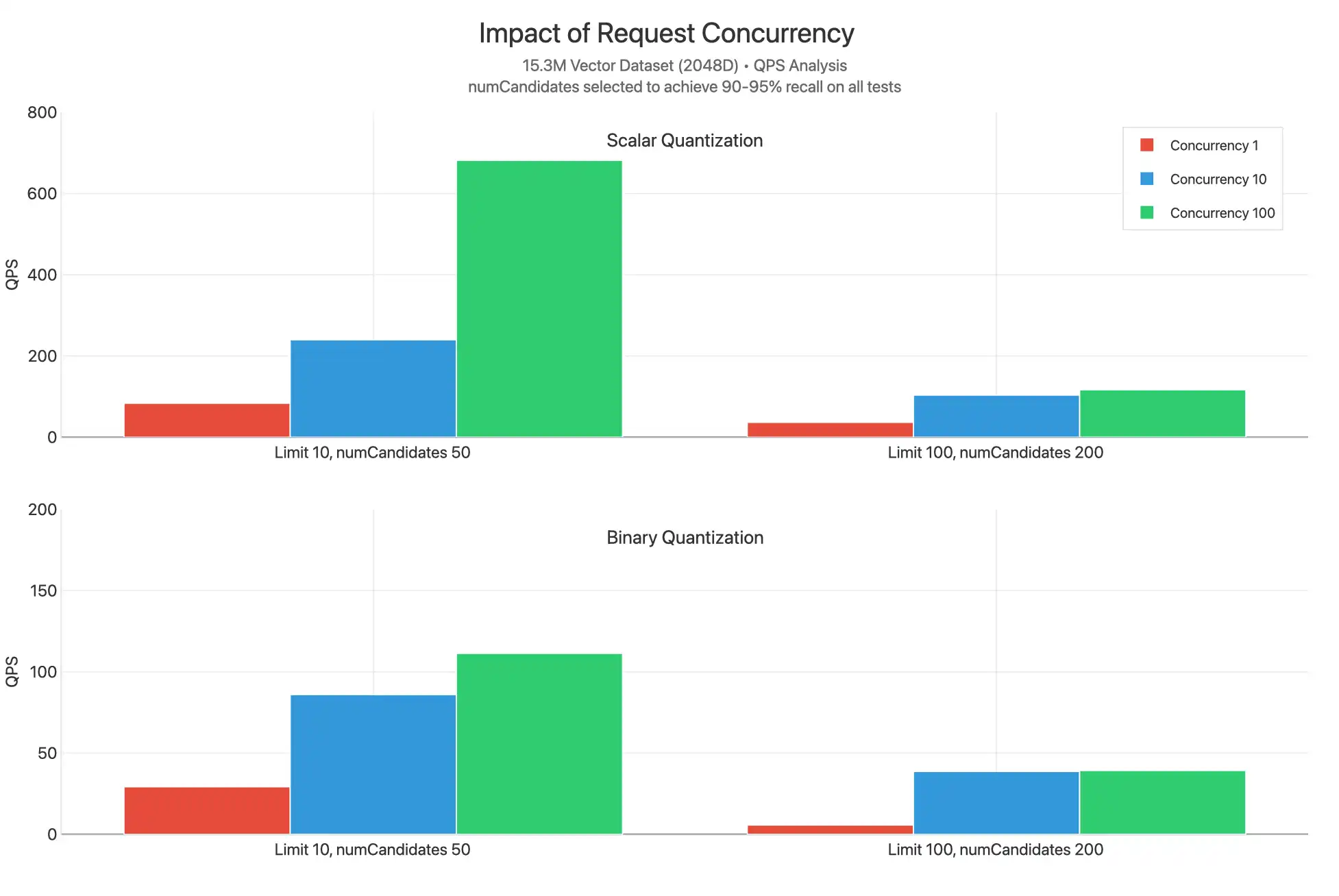
The graph on the left is a benchmark analysis demonstrating that the number of concurrent requests affects QPS (Queries Per Second) performance. The goal or the benchmark of the charts is to achieve 90-95% for the system to achieve top results. Reading the graphs you can intepret that small QPS increases performance and large QPS doesn't.


No comments:
Post a Comment