Benchmark Comparisons
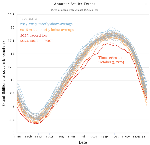
Really good data visualizations use benchmarks as powerful comparison tools to provide context and highlight meaningful patterns. As an example I have here a climate science reporting of major scientific organizations demonstrating this technique when showing Antarctic sea ice extent, where each year's measurements are plotted against a benchmark, the 1981-2010 median extent shown as a bold line across time-series charts. The visualization uses these benchmark lines in a different way albiet to project a sort of timeline to highlight the severity of current sea ice loss by showing how dramatically more recent years extent falls below the long-term average benchmark, making it instantly clear that we're experiencing unprecedented lows.
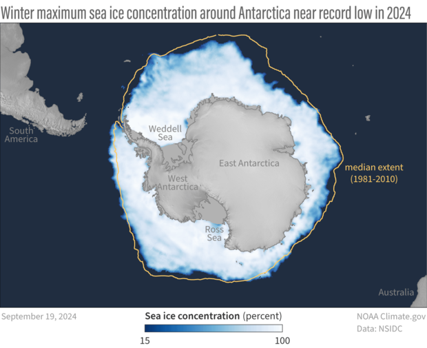
I think these benchmark graphs do show a good job at visualizing the narritive that they are trying to convey. The strategic placement of benchmark lines at key reference points creates a broader understanding to someone like me who is not completly familiar with climate sciences. I personally feel like techiques such as the two shown here work across multiple domians, not just in data science, making things geniaully interesting to even someone not fixated on the topic. where every data point is automatically measured against what's normal or expected.


No comments:
Post a Comment