Monday, September 29, 2025

Blog Post 3

 Comparing Numbers

We live in a world driven by numbers. We are surrounded by prices, measurements, statistics, and scores. To understand them, we must compare them. We compare numbers in many different ways. This will show real life examples of how numbers are compared in society. There are many ways to represent number comparisons. It can be shown by bar graphs, pie charts, slope graphs, etc.


Example

This is salaries in New Jersey compare to the cost of living. The pie chart compares different factors to break down the cost of living. People also use these types of charts to calculate their way of living, but also to compare salaries and how they will be able to live with them. 

Process

1. Start with an idea.
2. Use multiples that go along most with your data for the axes.
3. Identify which chart type.
4. Minimize too many colors or unnecessary symbols.


Exploring VizHealth: Comparing Risk with Icon Arrays

Exploring VizHealth: Comparing Risk with Icon Arrays

Category: Comparing Numbers • Topic: Health Risk Visualization
Example of an icon array visualization comparing numbers

For this week’s post, I explored the VizHealth site from our textbook’s Chapter 2 prompt. The Using Visualizing Health section is active and offers two great, hands-on tools: a Risk Calculator and an Icon Array Generator. My goal was to test different inputs, watch how the visuals change, and reflect on how well these designs help people compare numbers (e.g., “How many out of 100?”).

Note: As of now, the Gallery and About Us pages may be unavailable. The “Using Visualizing Health” tab works and is what I used for this reflection.

Trying the Risk Calculator

I experimented with a range of inputs (age, sex, and other parameters). The most useful aspect was how the interface translates a percentage into something concrete—often framed as “out of 100.” That framing lets viewers instantly compare numbers: Is 8 out of 100 meaningfully different from 15 out of 100? Presenting risk this way supports quicker, clearer comparisons than raw percentages alone.

Building Icon Arrays (Screenshots)

The Icon Array Generator lets you set a numerator/denominator (e.g., 25/100), choose colors, and arrange icons. Below are two versions I made to compare how arrangement and proportion change the story. (Replace these images with your own screenshots.)

What Worked Well

  • Concrete comparison: Seeing filled vs. unfilled icons makes differences tangible (e.g., 10/100 vs. 25/100).
  • Instant feedback: Changing the inputs immediately updates the visual, which encourages “what-if” exploration.
  • Accessible framing: “Out of 100” is intuitive for most audiences and supports side-by-side comparisons.

Challenges & Design Watch-outs

  • Arrangement matters: Different icon layouts (clustered vs. scattered) can change the perceived risk.
  • Very small/large risks: Extremely low or high probabilities can be tricky to show legibly in a 100-icon grid.
  • Labeling & color: Legends and direct labels are essential so viewers interpret highlighted icons correctly.

Takeaways for Comparing Numbers

  • Use icon arrays when you want audiences to feel the difference between counts (e.g., 8/100 vs. 20/100).
  • For change over time or between two groups, try slopegraphs or dumbbell plots (ties to Evergreen, Ch. 3).
  • Keep designs minimal: clear titles, direct labels, and colors that highlight the comparison—not decoration.

Overall, VizHealth is a strong learning tool because it turns abstract risk into concrete visuals that invite quick, meaningful comparisons.

Links

🔗 Explore the tools: VizHealth — Using Visualizing Health
🔗 Main site: vizhealth.org


Comparing Numbers with Data Visualization

Comparing Numbers with Data Visualization

Data visualization infographic

Why Compare Numbers?

When we see raw numbers in a table, it can be hard to quickly perceive which values differ, by how much, or spot patterns. A good visualization helps turn those numbers into insight. Comparisons are one of the most common tasks in data — we often want to know “which is larger?” or “how much more/less is one compared to another?”

1) Inspiring Examples of Comparisons

  • Side-by-side bar charts comparing categories (e.g., “Plant 1 vs Plant 3”).
  • Dumbbell plots or slopegraphs to show changes across two groups.
  • Back-to-back bar charts to compare two categories like male vs female.
  • Read more: 7 Best Comparison Charts

2) Sample Datasets You Could Use

  • Demographic breakdowns (e.g., age by gender).
  • Sales by region.
  • Before & after/treatment vs control studies.
  • Survey responses across groups.
  • Sports statistics like player performance comparisons.

3) Tools & Libraries to Build Comparative Visuals

Tool / Library What It Offers Best For
Tableau Public Drag-and-drop interface, interactive charts Rapid prototyping and comparisons
Power BI Microsoft ecosystem integration Business dashboards and organizational use
RAWGraphs Open-source web tool, exports SVG/PNG Quickly making clean comparison charts
D3.js / Vega Javascript libraries Highly customized or interactive visuals

Tips for Making Effective Comparison Visuals

  • Start axes at zero for fairness in bar charts.
  • Label values directly near bars or points.
  • Avoid clutter and remove 3D effects.
  • Pick the right chart type: bars, dots, slopegraphs, or back-to-back bars.
  • Use purposeful color to highlight differences.

📎 Further Reading

- Evergreen, S. Effective Data Visualization - 10 Useful Ways to Visualize Data

Comparing CO2 Emissions: A Visual Story of Change Over Time

 When comparing numbers visually, one of the most powerful stories is how things evolve. Here is  a real-world example: comparing CO₂ emissions of several large emitters over time. You’ll see how to visualize and interpret it.

This line chart compares total CO₂ emissions (in billions of tons) by country from 1990 to 2020. As you can see:

  • China’s emissions surged after 2000.
  • U.S. emissions have slightly declined.
  • India’s emissions are growing steadily from a lower base.


https://youtu.be/YUi31_ZrHTE


BLOG POST 3

 BLOG POST 3

DAWSON JOSEPH


COMPARING NUMBERS

Introduction

    This week, we had a pretty insightful look at how to compare numbers and how we could use graphical data and visuals to assist us in doing that. Throughout the reading of chapter 3 I could really feel it all come together, not only in how we compare numbers but seeing what sort of data visuals they ended up using and how much we actually use them in real life. We also were introduced to slope graphs and different sets of bar graphs. For me, this week has probably been one of the more "learning experiences" for me because I was able to learn something new. It wasn't like it was a pie chart and it hit me with the "Oh! I've seen this before" but I explored several different types of bars and even through the readings I learned more about the critical side of data visualization and how that all ties back into making our visuals in the first place. 


What Tools May Help Us Construct Visualizations That Compare Numbers

     Of course, the first thing I want to highlight before I give an out source is excel. Now we've been using excel now for about two weeks and we could see that it has a lot of plentiful and bountiful ways for us to make exciting visuals that could grasp the readers or viewers attention, but it also has ways for us to play around with the graphs and comparing numbers. This week, we did a bar graph and a slope graph. Below attached, I'll show my Slope graph and how I was able to construct it.

  Excel continues to be a tool that we could use always when it comes to creatively and also effectively displaying data from a data set and especially if we want to compare numbers with its vast set of options.

Another site that I found was a site called Meta Chart. On Meta chart, you can do the same thing when it comes to comparing numbers. The site has a vast amount of graphs that you can use almost similarly to excel. https://www.meta-chart.com/


OVERVIEW
Overall, this week was an exciting time because of the new graph that I was introduced to. We also see how much we are comparing numbers and how much visually we always need to make sure we get right. Although the processes were tedious, it was definitely worth while.

Data Visualizations about the Cost of College


We begin with three charts whose trends confirm the common belief that college is a financially valuable experience and endeavor. The first two bar charts by the Bureau of Labor Statistics use the effective benchmark line (which will be discussed chapter 4) in denoting the median weekly earnings and the unemployment rate for all workers. The third bar chart by USAFacts (but with data by the BLS) illustrates the same idea as the first bar chart albeit with older data and a lack of benchmark line, but I included it because I enjoyed how the title succeeds in emphasizing a single number (as discussed in chapter 2). 
This chart still supports that idea but from a different perspective. Also, I wish that they would include the legend on the side rather than on the top, but the dashed line signifying the national average was decent. 
With such conceptions about the worth of education, it is no wonder why the number of adults with college degrees is increasing; we can also note the decrease in adults without a high school diploma. I am interested, however, in the drop and jump around 2000 and 2015, respectively, for bachelor's degrees. 

These four charts illustrate that the rising demand for higher education has been coupled with a rising price tag for it. However, it has come at a disproportional rate compared to the rise of wages or the rise of the prices of other goods. I offer no explanation to the phenomenon as it is far too vast and multifaceted for me to research at the moment. For example, one of the causes may be Baumol's cost disease which I learned in a macroeconomics class. It goes as such. Some sectors such as manufacturing are becoming more productive fast due to factors such as technology and so their wages can rise without increasing the prices of the products. Some sectors such as professoring(?) cannot become that much more productive, but since all wages typically scale with overall productivity, professor wages, a core component of tuition, must rise also to maintain competitiveness. 
As such, student loans and consequentially debt has also risen at a major rate. 
Stepping away, the topic is not appealing (although it is fascinating and worthy of exploration) but I just wanted to finish what I started in my other blog. Additionally, I wished to find a chart type for each that were discussed within the chapter, but it was extremely hard to find ones that related to this topic. For example, this is the only thing that resembled a dot plot at all, and even then, I hate how they organized the types of majors although it tells a good (although unfortunate) story. I could not find a population pyramid, but it would have been lovely to have found one that compared student loan (debt) for males versus females and the various age groups. It seems that bar/column charts and slope graphs are the two dominant ways to compare numbers. 


Comparing Numbers - Davinia


 Tools & Examples For Comparing Numbers 

Data Visualizations
Data Visualizations are useful when you are comparing numbers because they help you see differences, patterns, and relationships that can be found in the data that is being presented. These visuals help highlight trends that can be overlooked, giving the viewer or reader a quick and easy understanding of values that can be increasing or decreasing over time. 


Bar plot of Chicago Crime / Mollie ...

Bar Chart 
Bar Charts are most useful when you are doing a side-by-side comparison. For example, crime rates in different cities. Comparing the lengths of the bar charts makes the data easy to understand when determining which values are higher or lower in relation to the data being presented. Beside is a bar chart that demonstrates the Crime Rate in Chicago in 2018. 


Line Graph 
Line graphs are best when comparing numbers over a series of time. For example, any sort of monthly unemployment rates or population growth. Line graphs are best to demonstrate trends, and when there is an increase or a decrease that needs to be shown visually.
Line Graph | Population growth by continent | Line Chart Examples | Population  Graphs
Above is a line graph representing the Population Growth in the United States from year 1900-2000. The population is measured on the y-axis of the graph in millions. 


Bar Graph 

Representing statics of online shopping over the years going back as far as the year 2018. 
There are two comparisons being done at the same time with In-store, and Online shopping it's being graphed that In-shopping has surpassed online shopping by 4-5 trillion dollars. 

As the years progress, we see an incline of in-store shopping to continue to positively grow, and we also do see a positive incline in online shopping but its revenue as far more down than in-store shopping. 

My thoughts on in-store shopping I can try and actually see the product and decide if it is something I would like to purchase but also having the inconvenience to order through my phone and wait until it arrives. Maybe because I am from a small area the mall center located to me is practically no stores inside, I was quite shocked with the numbers that in-store shopping bring. 


Tools that may help us compare numbers

 Data Visualizations

When creating visuals that can help us compare numbers there is a wide variety of options you can use. Some options include business intelligence platforms, free web-based tools and programming options for custom visuals. The human brain processes visual information much faster than text or raw data, making visualizations so important when presenting data. 


Microsoft Excel

One tool I like to use when creating visuals that can help us compare numbers is Microsoft Excel. Excel offers a variety of charts to use including pie charts and bar charts. Pie charts offer simple and visual clarity with their simple design. They can be used to compare data in a very simple way. Pie charts are ideal when displaying how each category contributes to the total value of the dataset such as showing market share percentages of a company. Since the circular format is simple and familiar it makes it easier for the viewer to understand the chart and data presented. Another good tool is the bar graph. Bar graphs provide clear visual data of different categories. This type of graph helps us quickly interpret data and identify trends occurring within the data. I personally like creating visualizations in excel the best. The easy layout helps me be able to organize my data in the excel sheets and then use that to create and format a visual how I want it to look like. It allows me to create the best visual for viewers as a non-designer. 


Comparing Numbers: Real Examples from 2025's Best Data Visualizations

Comparing Numbers Blog Post

Data Comparison Charts Examples

National Geographic created this awesome visualization showing how COVID-19 affected income levels worldwide. They compared three income ranges across different countries and made it super clear that the pandemic pushed 100 million people into extreme poverty. The dark background makes the numbers pop - you get it instantly.

There's this incredible "History of Pandemics" infographic that compares every major pandemic by scaling the visuals to match death tolls. So the bigger disasters literally look bigger on the chart. It's genius because you can see which pandemics were the worst just by glancing at it.

Interactive Data Visualization Dashboard

NASA's asteroid tracker is basically like Google Maps for space rocks. You can compare thousands of asteroids at once - their sizes, how close they are to Earth, where they're heading. Instead of boring spreadsheets, you just look around and immediately see which ones are huge vs tiny, close vs far away.

This meteorite map won a Webby Award for showing 34,000 meteorite impacts. You can see where they hit, when they hit, and how big they were - all at the same time. Way better than trying to read through thousands of rows of data.

And there's this water usage visualization that compares how much water different foods need. Turns out chocolate needs way more water than you'd think! The visual comparison makes it obvious which foods are water hogs.

These examples work because they make comparing numbers feel natural. Instead of making people do math in their heads, good visualizations let you see the differences immediately. That's the real trick - turn number comparison into visual comparison.

Source:
The 30 Best Data Visualizations of 2025

Examples of insightful data visualizations that compare numbers


Data visualizations that compare numbers

    Numbers can tell a story, but it's just easier to understand it through infographics. Data visualizations help us understand the comparison of numbers, making it clearer and simpler. The material below displays helpful types of data visualizations that compare numbers. 

Types of Charts that help 

    Starting off, a slope graph compares two points of two conditions across two lines. It's a good type of data visual that displays direction and by how much. Helping people understand the patterns in a short span of time by consuming the sets of data being compared. Another type of data visualization would be a dot plot. It uses dots on a line to show data for different things. Comparing two or more of the same topic, like two genders, and then involving a topic like who eats more types of fruits. This type of visual is very simple, making it quick to look at and then understand the differences. 

    Moving forward, a stacked bar chart displays how different parts add up into one topic, while showing comparisons across topics.  This kind of chart has a stack, each representing a part of a whole. The values add up to the total data. The design allows the reader to have a complete view of the different sets of data. Making it useful to compare, it offers a bigger picture. For example, the stack bar chart shown below demonstrates what was spoken about in the material above. 


Resources

Pinterest

Datylon

Insightful Visualizations that Compare Numbers

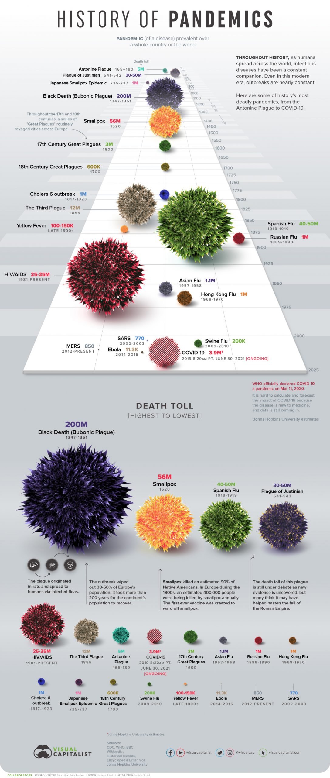
Effective Examples of Visualization for Comparison

Whether the visualization is employed to compare numbers or highlight trends between different groups of data, it is a powerful tool for communicating a clear and concise story of the data. The following sections will demonstrate some of the most effective forms these visualizations can utilize. 


Bar/Column Chart 

These types of charts are the simplest yet effective visualization technique for comparing numbers by representing the values and categories of data through vertically or horizontally oriented rectangular bars. Utilizing the x-axis to define the categories and the numerical values on the y-axis, with the length of the bars serving as a quick means of analysing the disparity or commonality between the categories. For instance, the chart below identifies the common items purchased for Valentine's and illustrates the percentage of how much people spent on these categories in 2022. With chocolate and other food-related Valentine gifts taking the lead. 

Bar Chart Example

Side-by-Side Chart

Expanding upon the bar or column charts, a Side-by-Side graph uses the same bars to represent the value of each category; instead, this graph pairs individual bars together that each represent specific subcategories within the same group to better showcase at a glance the differences between the bars. However, it is best to use at most two category groups; otherwise, the graph can become cluttered and difficult to read. For example, this Side-by-Side chart highlights the differences between Male and Female students by late excuses, noting overslept being the most common excuse by Males that nearly dwarfs the number of female students using the same excuse. 

Side-by-Side Chart

Line Charts

Instead of bars or columns, line charts utilize dots on a graph to represent a series of data points connected through a single or multiple lines. For the comparison of numbers, the path created by the interconnected data points helps to highlight the patterns or trends of the data, showcasing instances of growth, stagnation, consistency, or a drop in value for the categories. Most commonly seen in financial or economic industries, for example, these help illustrate the rise or fall of figures in the Stock Market. As demonstrated in the example below, this line chart showcases the steady growth of Meta's (formerly known as Facebook) annual revenue across its platforms from 2010 to 2022. Reaching the highest point in 2022 at around $120,000. 

Line Chart Example

Slope Graph

Almost a simplified version of a line chart, a slope graph typically employs two data points on parallel vertical axes connected by a line to visually track multiple categories in different scenarios or quantitative values to highlight changes over time or numerical ranking. As shown in this example, the slopegraph demonstrates fruit sales in tons between 2010 and 2022, highlighting orange with the lowest sales over the year compared to the other top-selling fruits. 

Slopegraph Example

Conclusion

Regardless of the visuals you use for comparing numerical values, it is best to first understand the message or story behind the data that you want to communicate to the intended audience. By doing so, the data will be more effectively represented in a format that provides the most readability and clarity.


REFERENCES

7 Types of Comparison Charts for Effective Data Visualization

24 types of charts and graphs for data visualization

Slopegraphs : A comprehensive guide 

Side-By-Side Bar Chart: Pinpoint Insights in a Snap

VHS Learning (Side-by-Side Example)


Sunday, September 28, 2025

Tools that Help Compare Numbers

Comparing Numbers

Comparing numbers is one of the most vital components of data visualizations. Numerical data is factual evidence of statistics which supports and reinforces an author's claim. Visualizations that compare numbers are a fantastic means of communicating the data that we collect when performing experiments. When reading the collected data in a table, it may be difficult to comprehend or recall. Visualizations aid in understanding the trends and patterns that emerge from this data. Comparing numbers not only provides a visual aid for numerical data, but also puts it in evaluation with other data sets. The following tools are extremely valuable when constructing visualizations that compare numbers:

Excel

Excel is the quintessential tool for creating visualizations from the collected data entered into the program. Its versatility allows users to choose from a variety of graphs. The figure above is a slope graph that I created with a given set of data. It reflects the change in price of different grocery departments from an old site to a new site. Excel gave me the ability to edit the format to my preferences. For instance, I colored the negative slope and the greatest increasing slope because they are my two most important pieces of data. It is clear that one reflects the biggest price drop while the other shows the greatest price increase. Consequently, the remaining data is not as important, but still comparable, so I changed the color of that data to gray. Excel allows me to easily compare two numbers of a real-world scenario that affects everyday life. This visualization is one of the many functions for comparing two numbers in Excel.

Canva


Canva is one of my favorite tools to use when comparing two numbers. Its numerous tools for enhancing visuals serve to create engaging data visualizations. The figure shows several graphs created in Canva, which compares different series of data. It is evident that the different colors on the trends represent a different set of data. This makes the numbers easy to recall and compare with others. Similar to Excel, Canva gives users the ability to format their graphs to suit their personal likings. While Excel is more efficient when dealing with raw data, Canva is a program that ensures your graphs are both appealing and memorable to an audience.

Datawrapper


Datawrapper is another valuable tool in the data visualization realm. While Excel is one of the most notable programs for holding data, some users may find it too complicated to use. Canva is also a great program, but users may consider it to be more of a graphic design program rather than an efficient data visualization tool. However, Datawrapper ties both of these programs together and serves as a compromise of the two. Not only does Datawrapper allow you to transform your spreadsheets into clean, visual data, but it also allows you to then export it into Canva. From there, users can edit the visualizations to their liking while maintaining the validity of the graph. The figure above is a prime example of Datawrapper's ability to compare two numbers, displaying the values of rural versus urban population. 

Conclusion

Overall, the aforementioned programs are ideal for comparing numbers of a data set. They each have abilities that enable users to accurate, yet visually appealing data visualizations. Often, collecting data is the first step in the path to displaying our data to an audience. Our inherent ability to easily comprehend images allows for us to thoroughly analyze data visualizations. In turn, we can easily recall the data presented to us. Ultimately, using these tools will certainly benefit users who want to transform their raw data into memorable visualizations.


Comparing Numbers

Flourish | LinkedIn


When we are comparing numbers, the tools that we use and how we use them shape the story we telling. The software we use doesn't just help us create a clearer story telling. It persuades and engages anyone who may be viewing such media. Without the right tools we may get innvoled in a messy spreadsheet that houses to much information etc. This is where Flourish comes into the picture. Flourish is a popular tool for creating great visulizations that engages the viewer.  And the best part about it is that its free. What makes floruish greate is the visuals that you can create with it. The ease of creating whatever template you need for whatever viusal makes Flourish standout. It starts with a template that you can pick then just fill in the graph. They have many templates to choose from so you're never really limited.

Creating a visualization – Flourish
Gif here shows the things you can do.
*not my work with gif*


What also makes these site great is how easy it would be to compare numbers. There are alot of templates to pick from so make comparing numbers becomes easy. This in makes  visualization quicker than the other ways. We dont' have to waste time trying to see if a certin graph fits because we can just switch on a dime. Lastly its great because of how easy it is to acesss it from anywhere. All you really need is a code and you're pretty much set. In all this a great tool to pick up to continue your viusalization journey.

Visualizing Comparisons with Data

When it comes to data visualization, one of the most common and powerful goals is comparing numbers. Whether it’s comparing groups, showing differences across time, or highlighting outliers, visuals make these differences obvious in ways raw numbers cannot. Good comparison visuals let us instantly see what’s bigger, smaller, increasing, or decreasing; Something that can take much longer to figure out from a table.

Example 1: Bar Charts

Bar charts are one of the simplest yet most effective tools for comparing numbers. The length of each bar makes it easy to see which categories are bigger or smaller at a glance. For example, a bar chart comparing monthly sales across different stores can immediately show which store is performing better in each month.

Figure 1 (Bar Graph Example)

Example 2: Slopegraphs

Slopegraphs are especially useful when comparing how numbers change between two points in time or conditions. Instead of only showing totals, slope graphs highlight increases and decreases by drawing lines between the two values. This makes it easy to spot which categories went up, which went down, and by how much.
Figure 2 (Slopegraph Example)


Comparing numbers is one of the most important tasks in data storytelling because it allows us to draw meaningful insights from information that would otherwise just look like a list of values. Charts like bar graphs and slopegraphs aren’t just decoration, they give structure and clarity to the story the data is telling. A well-designed visualization can make trends, differences, and patterns jump out instantly, helping the viewer grasp the “so what” behind the numbers.

For anyone interested in experimenting with these types of visualizations, a great tool to try is Graphmaker.org. This website allows you to quickly create a wide variety of charts and graphs by inserting your own data, which makes it an excellent resource for practicing comparison visuals. You can build simple bar charts, explore more complex slopegraphs, or even test out other visualization types to see how they highlight different aspects of the same dataset. The ability to easily customize and visualize your numbers makes it a practical option for students, professionals, or anyone looking to sharpen their data communication skills.

Ultimately, the best comparison visual depends on what story you want to tell. If the goal is to show straightforward differences, bar charts are clear and effective. If you want to show how something changes over time or between groups, slopegraphs add nuance and direction. Tools like Graphmaker.org make it easy to try both approaches and find the one that best communicates your message. By choosing the right visualization, you transform raw numbers into insights that are accessible, memorable, and meaningful.

Saturday, September 27, 2025

Inspiring Data Visualizations for Comparing Numbers

Data visualizations are more than just charts they are stories told through numbers. When done well, they help us quickly see differences, trends, and relationships that would otherwise be hidden in spreadsheets. Below are some examples of insightful data visualizations that excel at comparing numbers.

1. Bar Chart Race – Tracking Change Over Time

One of the most eye catching visualizations for comparing numbers is the bar chart race. This visualization animates bars as they grow or shrink over time, making it easy to see which categories rise or fall in ranking.

Example: The Bar Chart Race of the World’s Richest People by Flourish shows how individual fortunes grew and declined over the years. It is a very cool way to see how the times change and so do the rich. 


2. Gapminder Bubble Chart – Health and Wealth Across Nations

The Gapminder bubble chart by Hans Rosling is a classic example of how comparing numbers can reveal global insights. It compares countries by GDP, life expectancy, and population, using bubble size and movement to show change over time. bubble charts are a new thing to me so I had to find one that I thought would be cool to share with everyone.

 Example: Gapminder Tools lets you explore the same visualization interactively.


3. Stacked Area Chart – Energy Use Over Time

A stacked area chart is excellent for showing how different categories contribute to a whole. For instance, energy use by source over decades highlights both growth and decline in comparison.

 Example: The U.S. Energy Information Administration (EIA) uses stacked area charts to visualize energy consumption trends. See EIA data visualizations here. This is my least favorite out of the 3, but it allows you to see the break between the different sources. which depending on your audience can really strengthen or hurt your argument because it might not be as straight forward to all age groups.


Conclusion

From bar chart races that reveal changing rankings, to bubble charts that compare multiple dimensions, to stacked area charts that show shifting proportions, data visualizations make comparisons easier and more engaging. These examples prove that when numbers are visualized, they can tell powerful stories about our world.


Thursday, September 25, 2025

Check Out BarGraphMaker.net - Armani Johns


If you are looking for simple online chart maker checkout BarGraphMaker.net! The applications of this website is pretty limited but if you are having technical issues with excel this website can work just as good for making charts in which you are comparing numbers. They offer mainly bar charts but they also have histogram charts as well. Unfortunately they do not offer pdf downloads so that application is off of the table, but aside from that I think this website is a noteworthy tool if you aren't the most technically proficient with making bar charts.

Monday, September 22, 2025

VizHealth Data Visualization tools

                            VizHealth Risk Calculator 

            VizHealth's risk calculator is an interactive visualization tool and is a really good way to inform people about their cardiovascular health based on their personal information. Data visualizations often have a hard time conveying to people how the information they present applies to them. Tools like this one allow people to skip the hard part, telling them exactly what the research is saying about the reader, allowing them to make informed decisions more easily and more quickly.

                                 Iconarray.com 

            Vizhealth's icon array site offers a lot of features that are useful in the creation of simple data visualizations. You can mess around with all sorts of stuff, making the applications nearly limitless. There are male, female, gender neutral, and even non-gendered objects to choose from. This could be very useful depending on what story you're trying to tell and who you're trying to tell it to. Modifying colors is another great way to quickly display the information you're trying to present because it catches the eye and makes it easier for you to see the difference in demographics, especially when using red, blue, or green. Overall, this website is a powerful tool for creating basic statistical infographics.

                                         Rating

            Vizhealth offers not only solid data visualizations but is also a great resource on how to create them. They offer an informational comic displaying use cases for data visualization as well as useful tools for making them yourself. Vizhealth is a great place to start when trying to learn how to make data visualizations using statistics because they show you how they should be made and gives you the tools to do it on your own. 


Data Visualization VizHealth -Davinia Brito

 Data Visualization VizHealth 


                                                VizHealth Data Visualizations 

VizHealth

VizHealth is a project website designed to visualize and make health risk information simpler for people to comprehend and understand. The website provides clear and effective visuals and tested ways to provide medical and public health data. VizHealth offers open-source icons and graphics, but the two we will be focusing on are the Risk Calculator and the Icon Array Generator. 

Risk Calculator 

The Risk Calculator is an input generator that allows you to enter demographic and health data, for example age, gender and other possible risk factors). Once the data has been entered, it processes a visual representation of the possible health risks that could occur, based on the data you've entered. The purpose of the calculator is to portray a visual percentage of risk rather than just being shown or told a number. The visuals help put the number into context where it is better viewed and understood. 


Icon Array Generator 

The Icon Array Generator creates a visual that demonstrates statistical risks or benefits, in a grid-like way in order to make it easier to those reading. Once you enter a number or percentage for example like 1 out of 10 or 20 out of 100, the generator creates a grid of icons and a portion of the icons are highlighted to whatever color you desire in order to represent those "at risk." Those that are not highlighted represent the not affected. This generator is mostly used for visualizing probabilities and making a more interactive way to deal with health statistics. Below is my example of using the Icon Generator with the percentage of Women Dying Due to Breast Cancer. 

 Visualizing Health

The website has a lot of coloration that involves inputting personal data to get a specific calculation or percentage of any future or current risks. For example, down below it has a generator risk calculator, Although I did notice it only had for ages 30 and above. Which made me think what type of age gaps the website targeting. Neat features but it was accurate reading as to my age now.

As I was playing with the Icon Array feature, I was editing to see calculations of different statics, and it had more clarity comparison to risk clarity that uses a chart graph to see the risks you have vs the Icon Array it's like a Bar Graph that you see the individual only that it only has occupancy of 100 people to compare the data with.


VizHealth

 Data Visualization with Vizhealth

Vizhealth

Vizhealth is a website used to make data visualizations for experiments.  Like other tools, it uses different colors and images to convey the story. I used the Risk Calculator and Icon Array Generator to create some visuals. They both work well for different forms of data visualization, and can help tell the story behind a data set. 

Risk Calculator

The risk calculator determines the probability of developing cardiovascular disease in the near future. They ask specific questions to determine gender, height, weight, age range, blood pressure level, prior history of diabetes, and if you are a smoker or not. There are very low, low, moderate, and high risk categories of cardiovascular disease. The range is from 0-40% on the X-axis to determine the risk factor's percentage. At high risk, it advises patient to see a doctor. In Figure 1.1, the age range is the lowest possible on the menu (30-34), and this person is female, not a smoker of have any prior history with high blood pressure or diabetes, and measures 5'9'' weighs 165 lbs. She has a very low risk of developing cardiovascular disease. In Figure 1.2, the person is male, ages 45-49, semi high cholesterol, 130-139 blood pressure, a smoker, has diabetes, and same height/weight. He has a moderate risk of developing cardiovascular disease. In Figure 1.3, this person is a male, ages 60-64, high cholesterol, 130-139 blood pressure, taking medication, a smoker, and has diabetes. He came up with the highest risk of developing the disease.

The risk calculator is an effective tool to determine risk factors for cardiovascular disease. It can be measuring the categories of risk factors. This is easy for the audience to understand, but also interactive. 

Figure 1.1
  
Figure 1.2

Figure 1.3

Icon Array

The icon array is an array of different symbols and ranges of numbers. The symbol options include solid rectangle, females, males, and gender neutral symbols. This icon array measures how many women develop Polycystic Ovary Syndrome (PCOS). In Figure 1.4, the array demonstrates about 1 in 10 women develop PCOS in their lifetime.


Pivot Tables

  Pivot Tables: Use Cases & Why They’re So Helpful (Chapter 10) Course: Ads, Fads, & Consumer Culture | Week 10 Topic Wh...